Did you notice the flurry of new features in Google Reader? Following (as in Twitter), liking (à la FriendFeed), people searching (Facebook-ish?), several Mark as read options grouped in a mildly confusing button+drop down menu combined control, a new Send to tool that only appears after having visited the appropriately well hidden last settings’ tab —who knew? I’m a sucker for features. Hey, I’m an engineer: the whole world is lacking in features, or suboptimal in some way to me. I also crave smooth user experiences, and unfortunately Reader is not feeding that weird need of mine.
Trouble is Reader looks like a playground. One where engineers have been given free rein to pile up new toys, unchecked by responsible adults. Reader was a nice newsfeed reader: now its bubbling its way up to become a social platform of sorts, haphazardly adding features all around, meatball style. Perhaps the old Zawinsky mantra should be rephrased for the brave new web:
Every program attempts to expand until it goes social. Those programs which cannot so expand are replaced by ones which can.
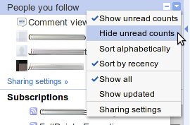
Let’s focus on some hard evidence: a rectangular area, 135 pixels wide and 150 tall, hidden from view until you surgeon-click on a teeny 10×10 down arrow symbol, meaningfully tucked away at the right side of the People you follow portlet title bar (just look at the illustration so you don’t have to take my word for that). A single, humble drop-down menu that accounts for no less than five different user interaction issues —and I won’t be looking at accessibility features this time. From top to bottom:
- First two menu items are mutually exclusive choices, though the use of checkboxes seem to convey they are not. That’s what radio buttons are for: to allow users to discern at a glance when one and only one from a list of options makes sense at any particular time. It’s a functioning metaphor, give it some respect, would you?
- When space is at a premium, why have two exactly antonymous actions (Show vs. Hide) when a single one would do? You have the checkbox indicator for that very purpose, don’t you?
- Sort alphabetically and Sort by recency also exclude each other nicely, but they cannot be compressed into one. Here radio buttons would truly shine, believe me.
- Whoa. Show all and Show updated. There you are, again. Someone has an axe to grind against radio buttons, I’m sure.
- Last, Sharing settings menu item is not meant to apply some immediate action upon the application; but to act as a gateway to a modal dialog. You have a way to show that behavior to users, and therefore enhance your application predictability: just append an ellipsis (…) there. Thats three more bytes (some more if you worship your HTML entities), but it’s for great justice.
See what I mean? I don’t like authority arguments thrown at me, but see this friendly reminder by Jakob Nielsen and this Stack Overflow thread. Now please excuse me while I go solving some real world-class problems. There is this smell coming from the sink…

